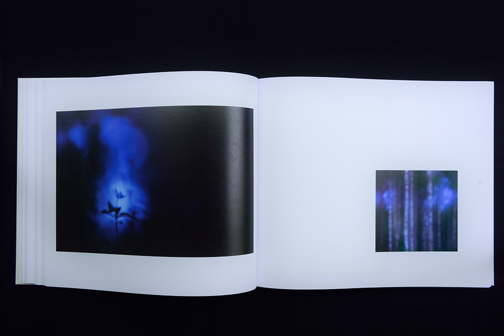
These are the bald facts about our coffee-table book. But which thoughts and decision processes are behind it?
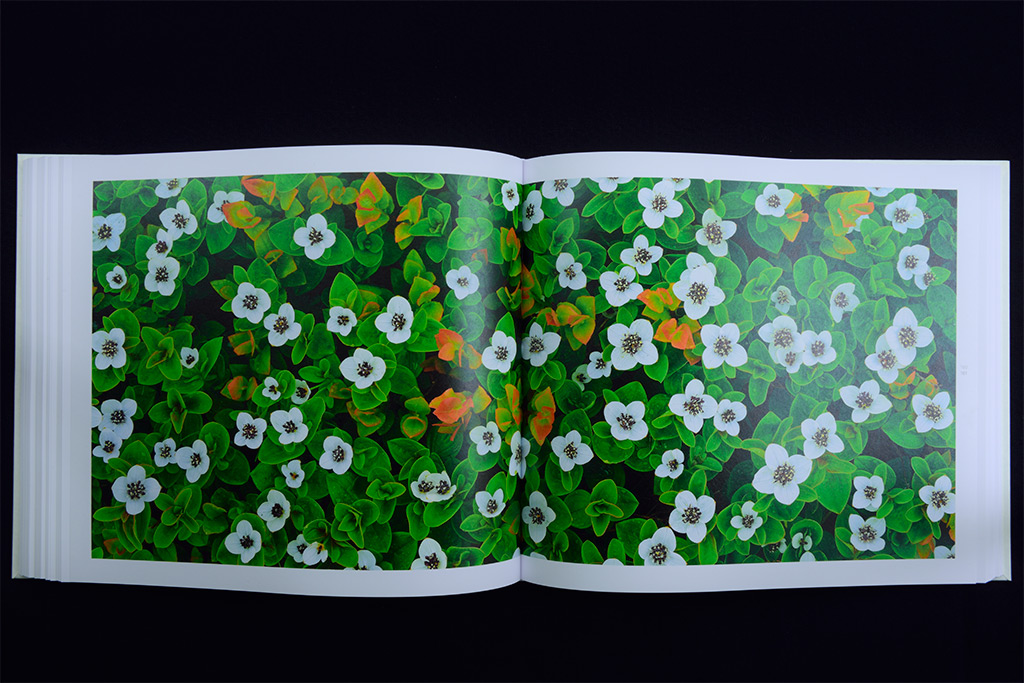
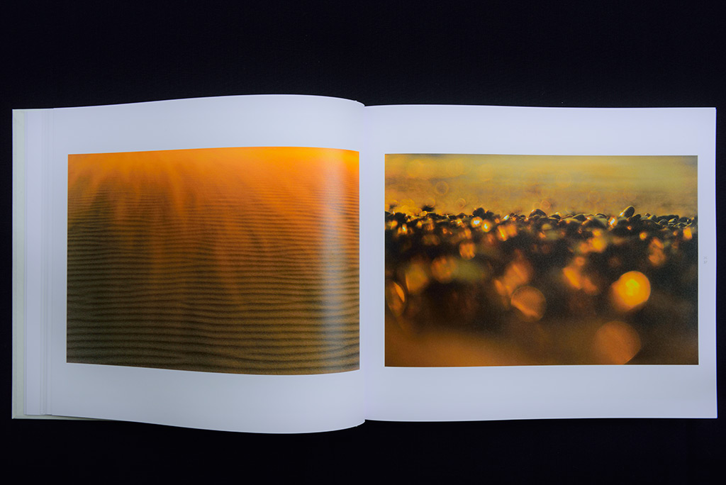
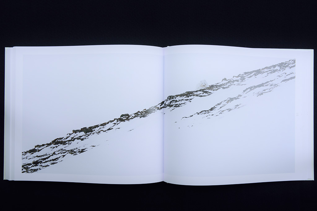
LYS, this is our project about the North, but not only when it comes to photographic topics in the meaning of content: The North has its own language of form; not for nothing Scandinavian Design is an established term worldwide. A design characterized by clear, reduced elements, expressive in its sincere sobriety, which also receives its strength from cultural tradition. Inspired by simple patterns and structures that are ever-present in the Nordic everyday life – water and rock, blossoms and forest – but most of all by what makes this region so unique: the constant alternation of light and darkness in the course of the year. Timeless aesthetic – serious and simple beauty being here to stay.
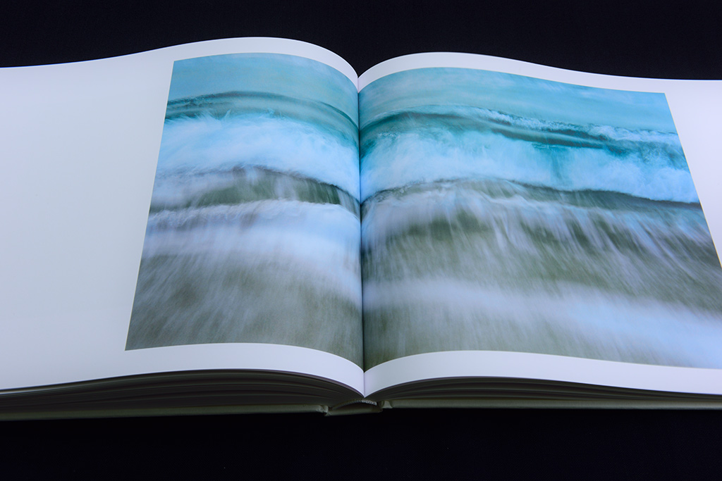
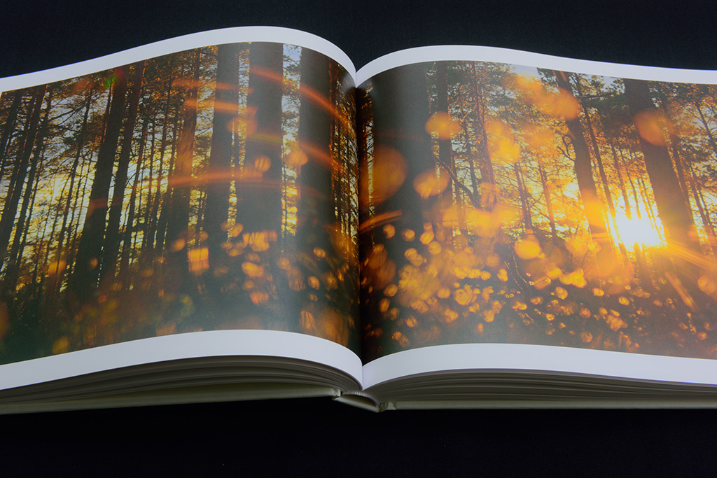
This is in the main aspiration we had for the content and form of LYS. But the practical realization was a major challenge: our images should express the character, the soul of the Nordic countries, the layout support their impression, and our texts should stylistically support the visual world of emotion. Every decision was followed by the next one: which font fits in with our aesthetic demands, what kind of paper was suitable for the images to unfold their full effect? And to make a decision always meant to reject another one. It was an adventure for us, chance and challenge likewise, as we never before have worked under such complex circumstances.
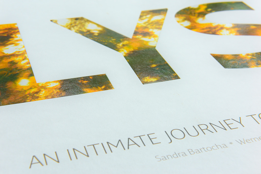
After all considerations we opted for Fresco, a font full of character and modest as well, like custom-made for LYS. And with Arctic Volume White we finally found a paper that fulfilled our qualitative ideas. It can hardly be a coincidence that the manufacturer is from Sweden …
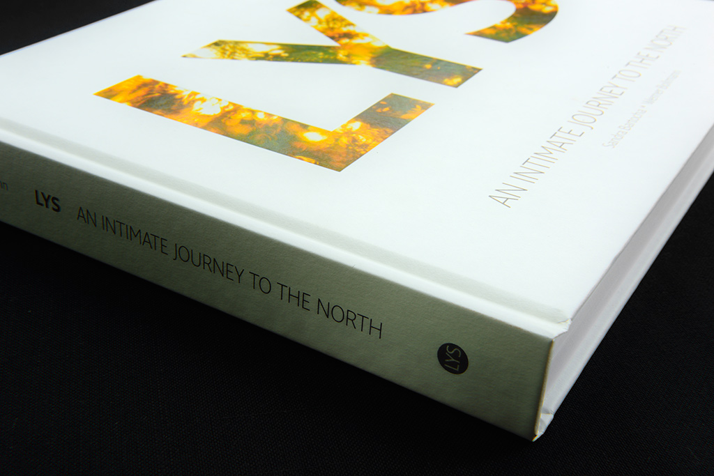
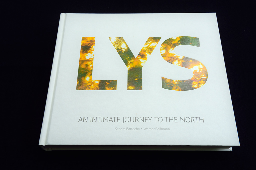
The cover of LYS has been subject to the greatest changes: at the beginning we decided to choose a birch branch as title image, for the simple reason that this tree accompanied us all over Scandinavia. But later on our title came to the fore more and more, these three wonderful letters. Their meaning is light and light should shine through them. The never ending light of the summer on white background for the cover and dancing polar light in the blackness of the polar night for the slipcase of the special edition – the whole range of Nordic light.
Even the longest creative process has come to an end, we finally have made our decisions. At this present day we hold the result in our hands and with big pleasure we can announce, yes, all our thoughts and considerations have been worth it …

